Uber
Timeline:
Services:
Product Design
Event Design
Social Media
Web
OOH
PM Tool:
Monday

TBD
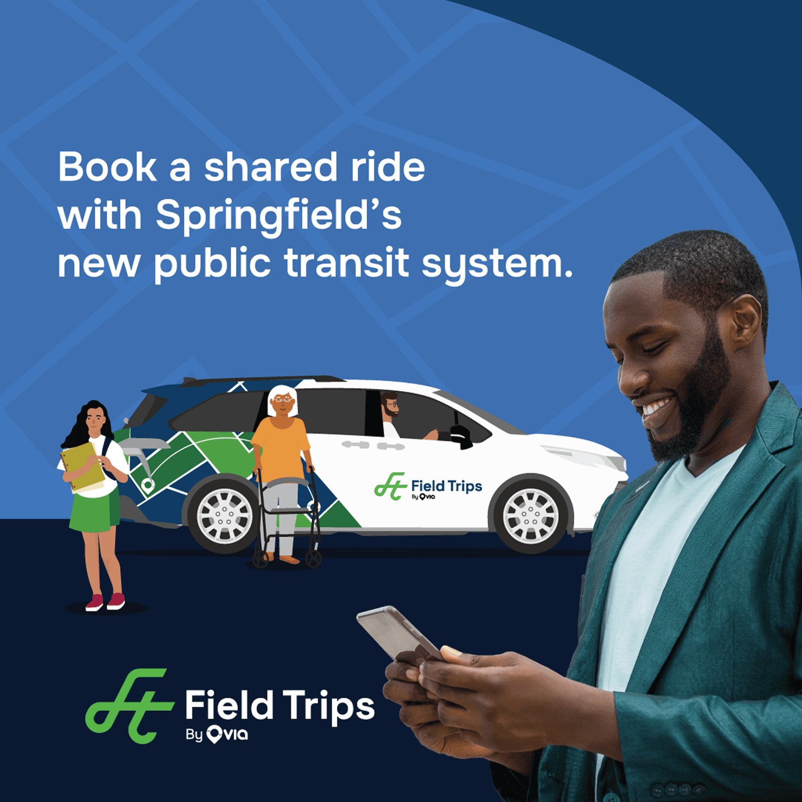
These are geo-targeted banners what will have a cross-device reach to users within certain proximity from campaign billboards, either static or on-the-road (such as trucks with installed billboard panels).


The Destination
These geo-targeted banners were optimized for cross-device responsiveness, ensuring visual impact and consistency for users within proximity of campaign billboards—whether static placements or mobile formats like truck-mounted panels.


TBD
TBD

TBD
TBD


TBD


TBD
The Concepts
The campaign was anchored by two primary creatives: one human-centered, leveraging in-house photography to reinforce brand authenticity and emotional connection; and another, more minimalist execution, which relied on strong visual hierarchy and the clever integration of Uber’s signature trajectory line. This dual approach balanced warmth and clarity, aligning visual language with both brand identity and campaign objectives.

At the start of this project, I was provided with broad parameters—technical specifications such as format, length, and messaging requirements. With any new client, it’s critical to quickly understand the project scope, design intent, and key elements in play.
One challenge I encountered was that the reference asset I received had been unintentionally altered, which obscured how the final deliverable was meant to appear. By carefully reviewing the components in Figma, I identified inconsistencies such as shifted elements, incorrect shadow values beneath the vehicle, and opacity layers that weren’t translating properly (classic Figma). I quickly corrected these issues across all assets, ensuring fidelity to the original design intent and maintaining consistency at scale.

TBD

TBD


TBD